—— Written in Bierstadt font ——
Trust me for a minute; this might get weird, but let’s think back to 2007: iPhone, Nancy Pelosi, the bald eagle, Lindsay Lohan, the Spice Girls, people thinking this is okay. You’re there now, mentally? You just signed up for Tumblr and are getting the hang of “hashtags?” Cool, so you understand that 2007 was a very long time ago, and the world has changed a TON since then. One thing that’s remained the same, though? The default font in Microsoft Office: Calibri. Until now.
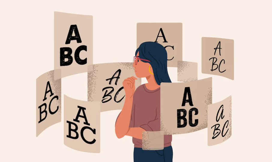
Before you close your laptop and attack it with an umbrella, hear me out. This change is really significant. The way words are presented visually can have a dramatic effect on our perception of their meaning. Shapes, colors, imagery, and typography are the four fundamental building blocks of great design. Fonts are essential to how stories are told and concepts are conveyed to the reader. Cognitive psychologists have studied the effects of typography on memory, information retention, emotional reactions, and behavior. Apart from the effect of typography on cognitive outcomes and perception, researchers have observed that humans can ascribe emotional and anthropomorphic qualities to typefaces.
Microsoft Office is used by over 382 million people worldwide. It is, undoubtedly, the world’s most well-known American multinational technology corporation. It has made a substantial contribution to the technology industry and has been at the forefront of technological development for more than 40 years. This is why this font change matters so much. The default font in Microsoft Office is inevitably going to be the world’s most-used font. If fonts can evoke emotions and influence how we perceive information, then a change to the world’s default font is essentially a change in how the world feels and relates to the messages on the screen.
Back in 2007, Microsoft changed the default font from Times New Roman to Calibri, recognizing that most documents would end up being read on screens instead of printed. Calibri had an illustrious career, even being at the center of a scandal. But the times they are a-changin’, and the world’s word processing is about to look different. Say hello to Bierstadt Aptos. Like Calibri, it’s a streamlined sans serif typeface that lacks the letter tips we see in Times New Roman and other serif typefaces. While Calibri is narrow, Aptos features wider (more friendly?) O’s and Q’s. The new default typeface is professional yet relatable. Aptos embodies professionalism, adaptability, subtle flourishes of expression, and more clarity.
Type designer Steve Matteson created the font and named it Aptos, “after his favorite unincorporated town in Santa Cruz, California, whose widely ranging landscape and climate epitomizes the font’s versatility,” Microsoft wrote in a blog post. Matteson describes Aptos as being “Helvetica, but with a human touch.” Even at 56 years old, Helvetica (called the font of the twentieth century) is still the most used font in the world. It was a safe bet for Matteson to choose as his font muse. Sans serif fonts are easier to read than their serif-sporting comrades, and audiences view them as being clean and simplistic. The messages conveyed in sans serif are interpreted as being straightforward, modern, and clean.
And if you’re like my aunt Ethel, convinced the “world is going to hell in a handbasket,” you can always change your default font back to Times New Roman like it’s 1932 again.

